Made on scenes. For the iPhone, the root scene is called MobileCalWindow.
Screen of the Day
Container UINavigationController. Navigation between pages-days were made on UIScrollView, the class was named BlockableScrollView. Scroll has paging enabled.
The memory stores yesterday, today and tomorrow. The Calendar uses a custom reuse system, something similar to UICollectionView, but managed manually. This is most likely done for optimization in the past — consider legacy code.
The event boxes were made as two-layer pictures. The first layer is the background picture, the second layer is the text inside the event. The filled line on the left side of the event view is part of the background picture. The event has two points to change the time - bottom left and top right. They were made large, but the background is transparent. Layout of the cells on the constraints.
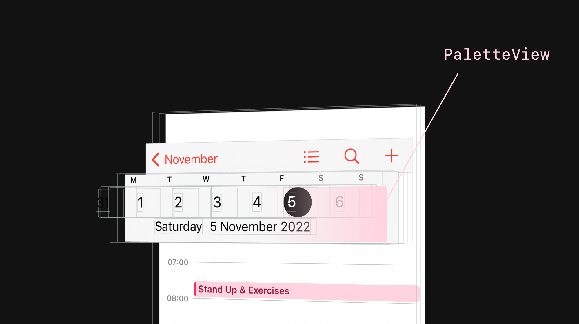
The UINavigationBar is basic, and on the right side added a Stack View for the buttons. The date panel is called PaletteView. It is an UIScrollView and is not part of the UINavigationBar. The entire panel was placed above the content but below the bar and attached to the bottom point of the bar. The background was repeated to hide the transition.
The time markup on the left is done on one layer, the text is drawn inside the CALayer. The time is placed on the left side of the screen, the events are shifted to the right.
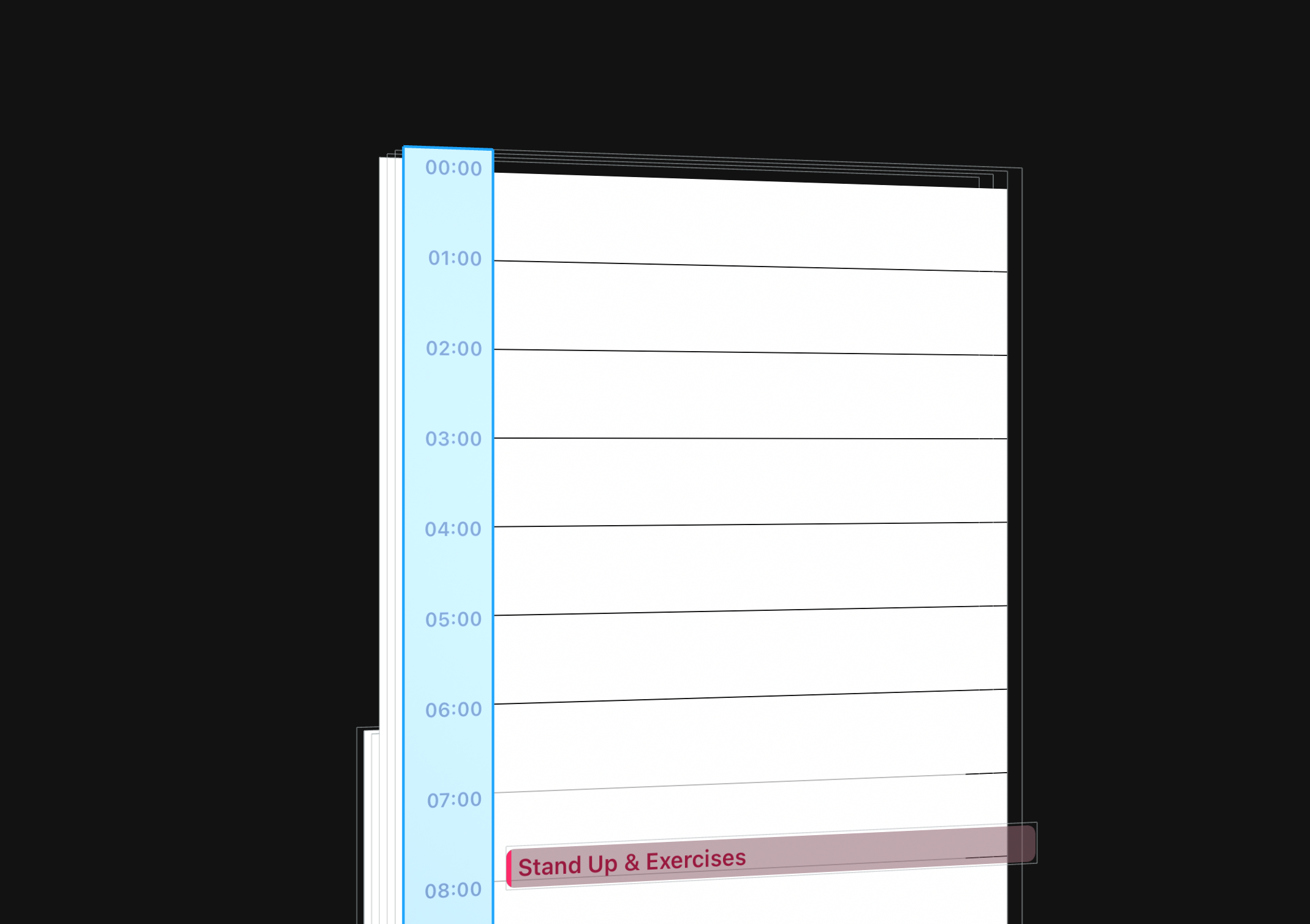
The timestamping is inside UIVisualEffectView, but I couldn't find any visual uses for the blur.
As I wrote above, the event is a picture. To process a picture click, you need to add UITapGestureRecognizer. That's what Apple engineers did - they added a tap gesture for each day's view. But a drag gesture was added to the whole screen, instead of separate gestures for each event.
New Event
The screen is presented as a modal controller. Made on UITableViewController, the table view is named EKCalendarItemEditorTableView.
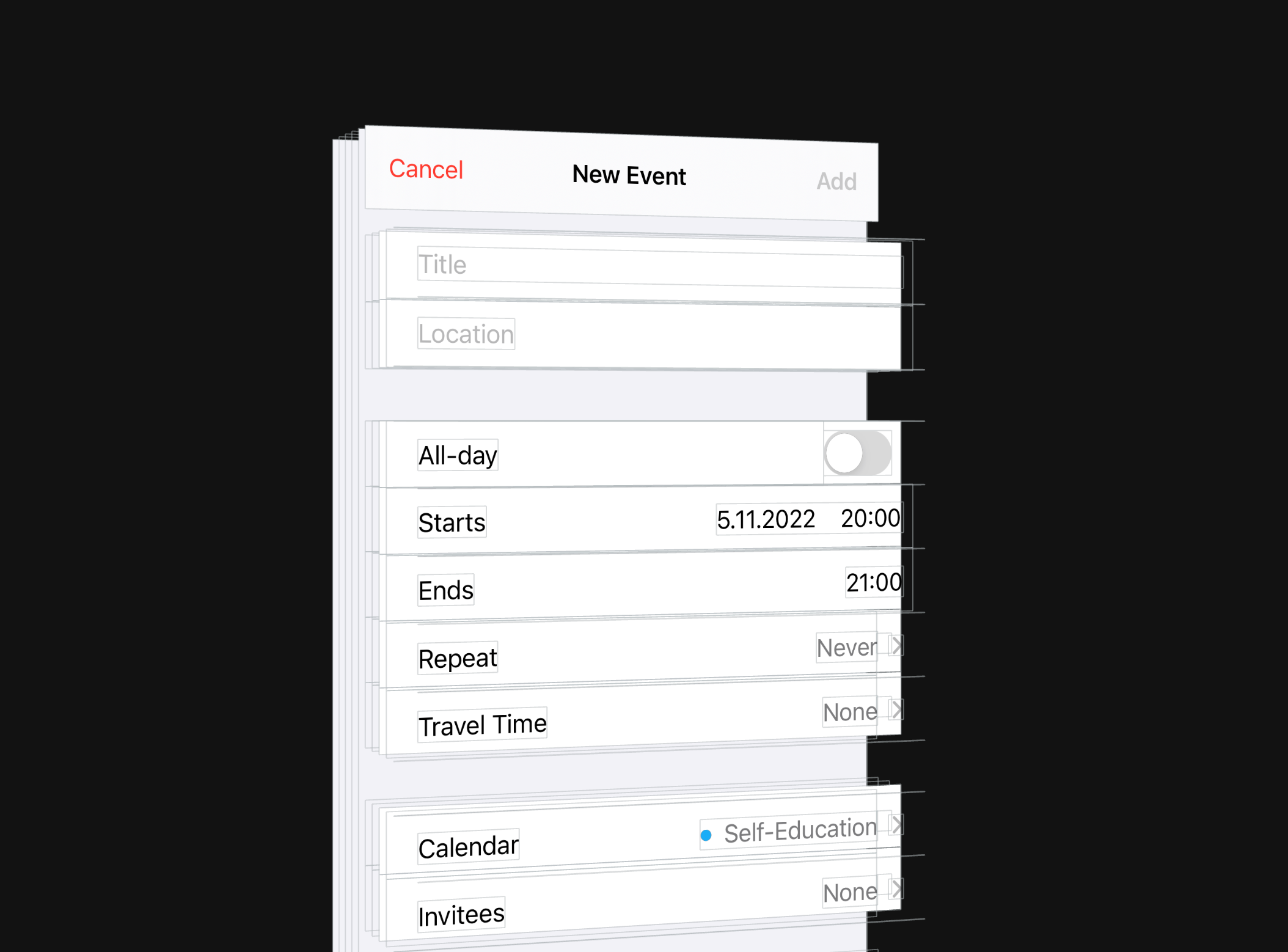
The cells are named EKUITableViewCell. The Disclosure Indicator on the right is system indicators. I didn't find anything special on this screen.
Screen by month
The main view UIScrollView. When you move to the month screen, the number pane of the PaletteView moves up. It stays in memory, but is not visible on the screen.
But the panel with the days of the week visually stays in place, but it is actually a copy. The original panel moves up with the PaletteView.
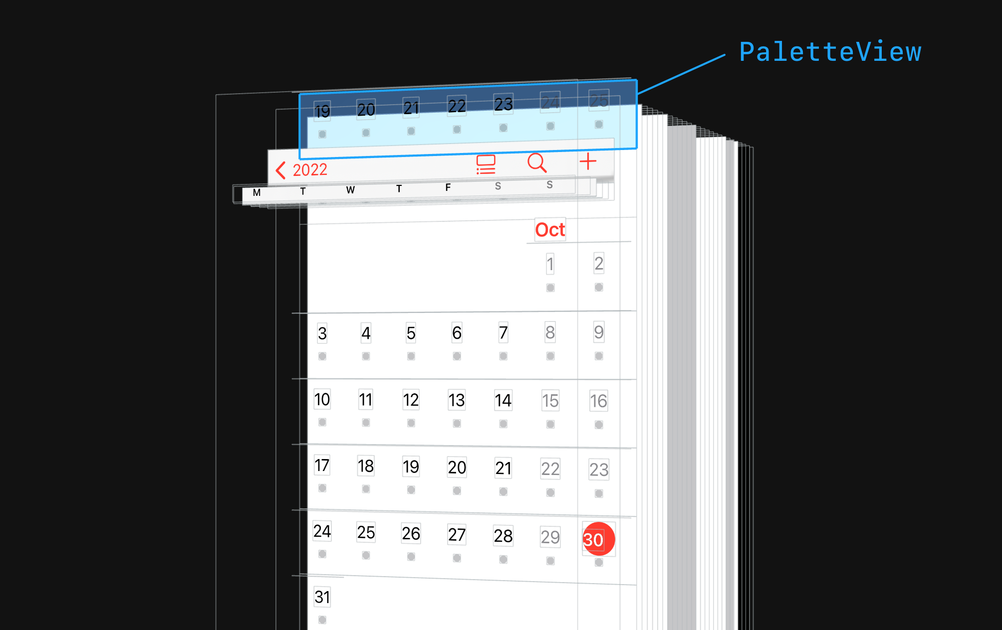
The names of the months are made in UILabel. The month is divided into horizontal weeks. The container is named CompactMonthWeekView.
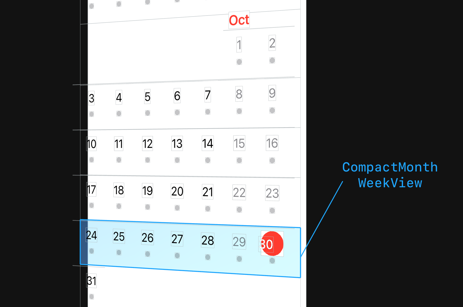
Inside the days of the week are made via CALayer. Only for the current day, which is a red circle, the date is UILabel with a red background. Called CompactMonthWeekTodayCircle. Layout on frames.
The separator between weeks is UIView with a background and height of 0.333.
Preview of the Day
The pop-up panel is a table. The cells are named EKUIOccurrenceTableViewCell. Layout on constrictions. Almost all distances between elements are set to a fixed value. The indent from the edges of the cell, too.
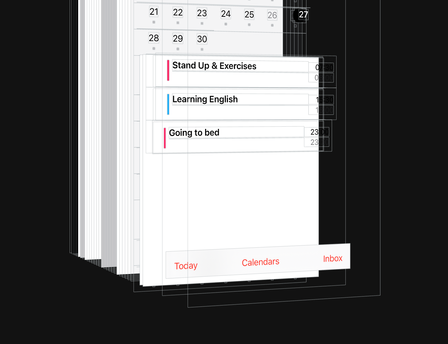
The content of the cells is made on the UILabel. The colored bar to the left is the UIView with a background.
Screen Year
The header of the years was made with UILabel. The container for the header is called CompactYearViewYearHeader. Months are grouped by 3 in a line. The dates inside the month and the name were drawn as a layer inside the view, called CompactYearMonthView.
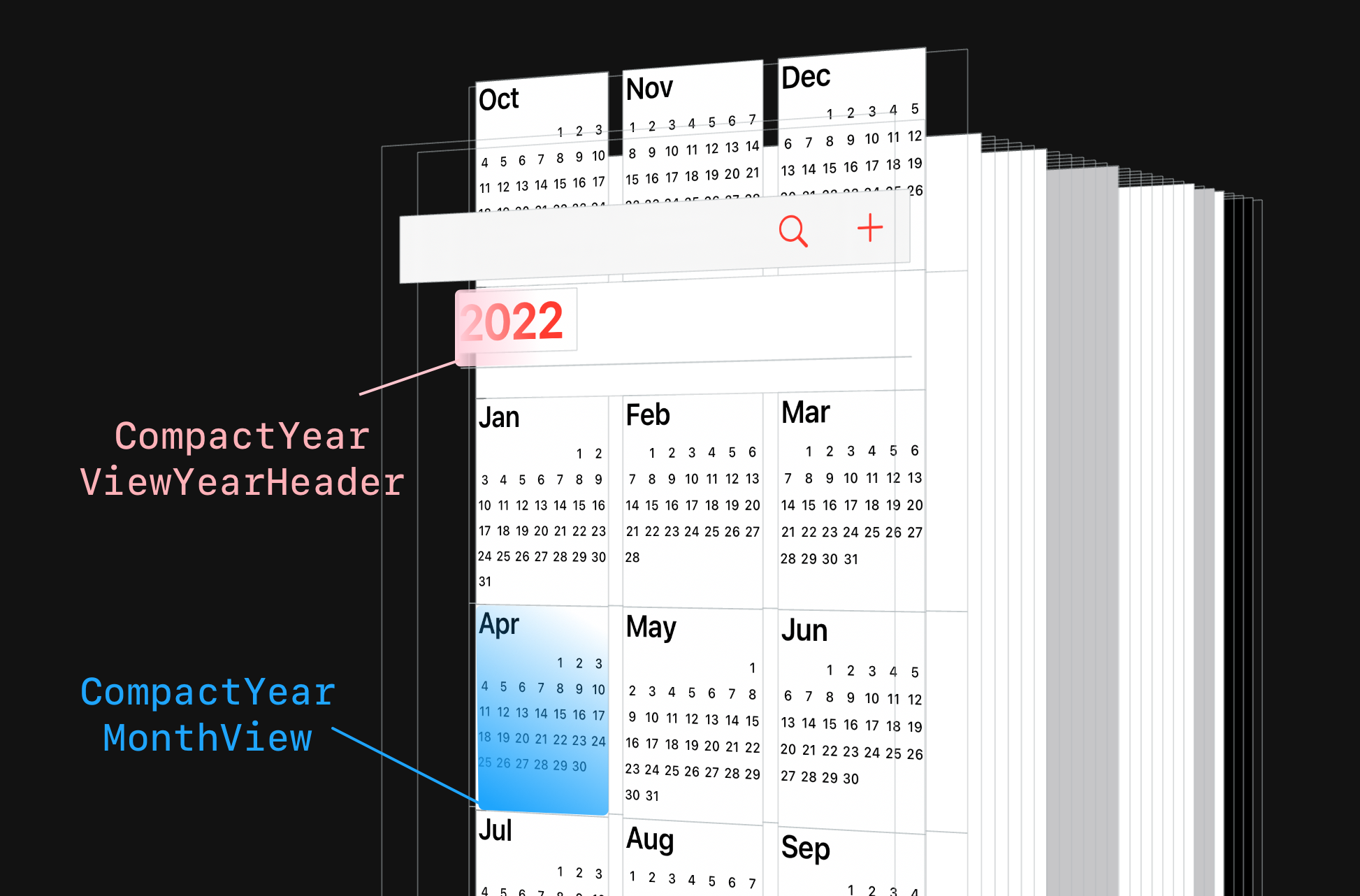
Made on UIScrollView with a custom reuse system.
List of calendars
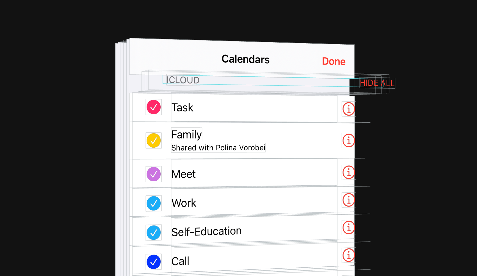
Made a table. The cells are called EKCalendarChooserCell. The round checkmarks on the left were made as pictures. Native screen without customization.
Accessibility
All interactive elements support Voice Over and Voice Control. Cues are placed.
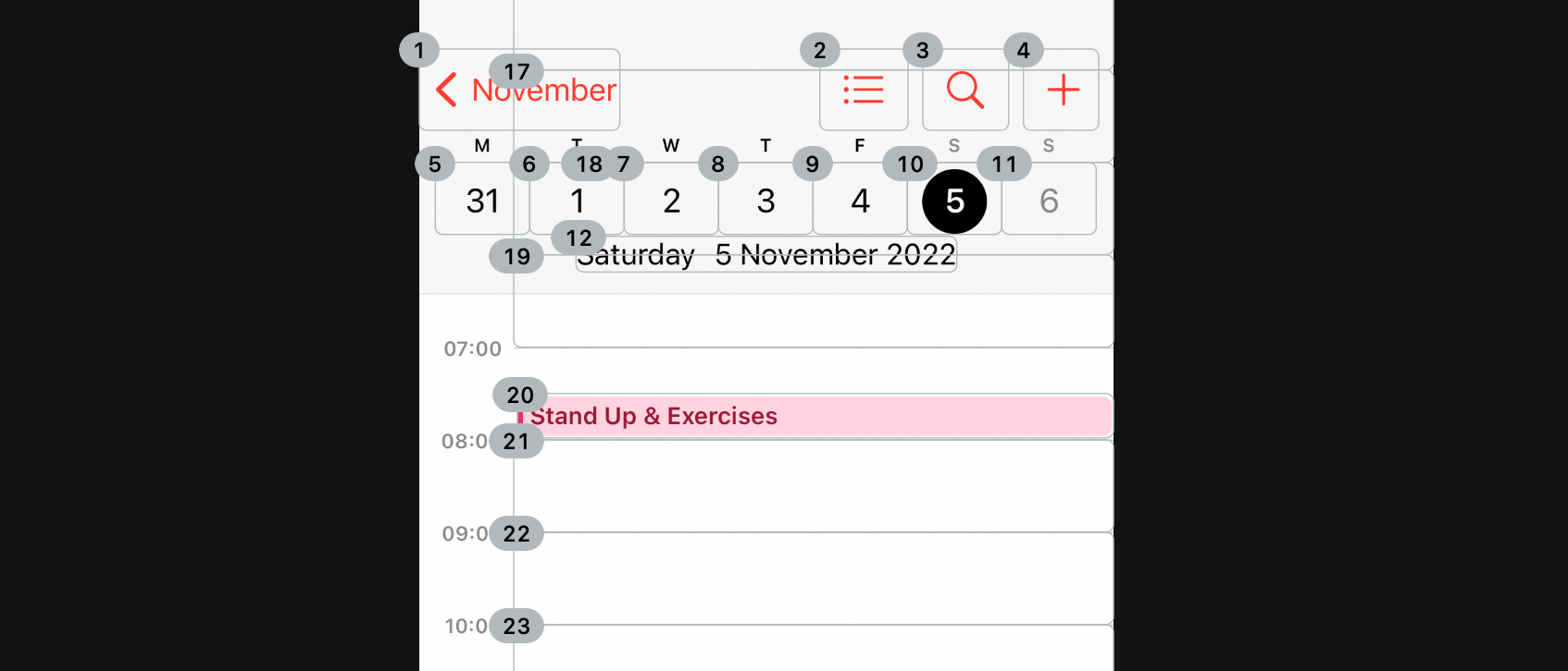
The voice control is marked for each hour during the day. The title, time, calendar and how to interact with the item are dictated for events.
On the year screen, Voice Control only for the months. Voice Over for the year and the name of the months.
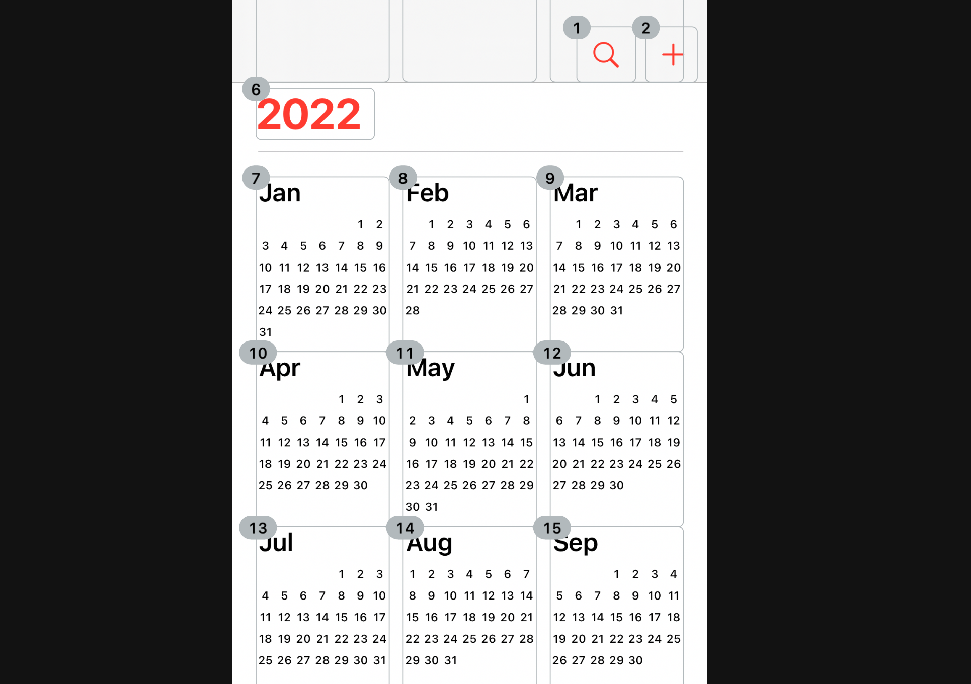
The Accessibility has been added throughout the application.

