
With TipKit, developers show native tips. They can be used to make a tutorial or draw the user's attention to new features. The tips look like this:
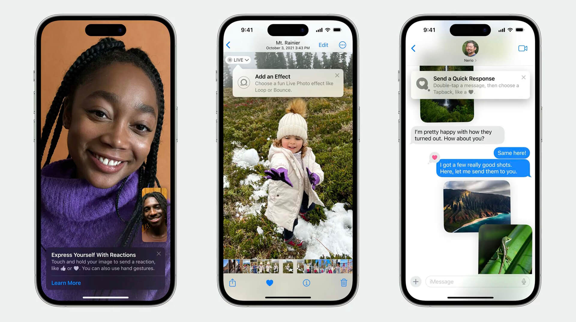
Apple has made the UI and the control of when to show them. The framework is available from iOS 17 for all platforms — iOS, iPadOS, macOS, watchOS and visionOS.
Each section of our tutorial will have examples in both SwiftUI and UIKit.
Initialization
Import TipKit and call the configuration method at the application entry point:
For SwiftUI
import SwiftUI
import TipKit

@main
struct TipKitExampleApp: App {

   var body: some Scene {
      WindowGroup {
         TipKitDemo()
            .task {
                try? Tips.configure([
                    .displayFrequency(.immediate),
                    .datastoreLocation(.applicationDefault)
                ])
            }
      }
   }
}
For UIKit, on AppDelegate:
func application(_ application: UIApplication, didFinishLaunchingWithOptions launchOptions: [UIApplication.LaunchOptionsKey: Any]?) -> Bool {

   try? Tips.configure([
      .displayFrequency(.immediate),
      .datastoreLocation(.applicationDefault)])

   return true
}
displayFrequency determines how often to display the tip. In the example it is .immediate, the tips will be shown immediately. You can set hourly, daily, weekly and monthly.
datastoreLocation is the data store of the tips. It can be:
- .applicationDefault — default location, available only to the app
- .groupContainer — through appgroup, available between targets
- .url — set your path
The default is .applicationDefault.
Creating a Tip
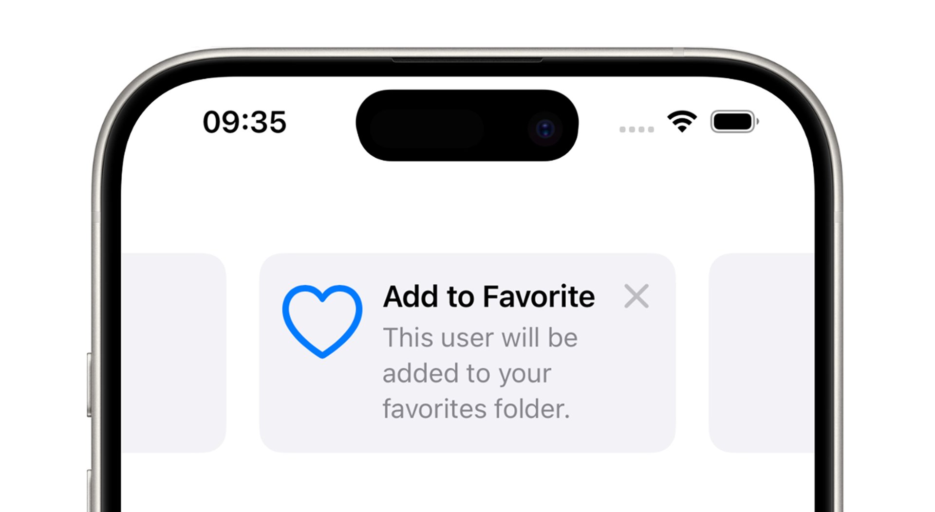
The Tip protocol determines the content and when to show the tip. Image and subtitle are optional:
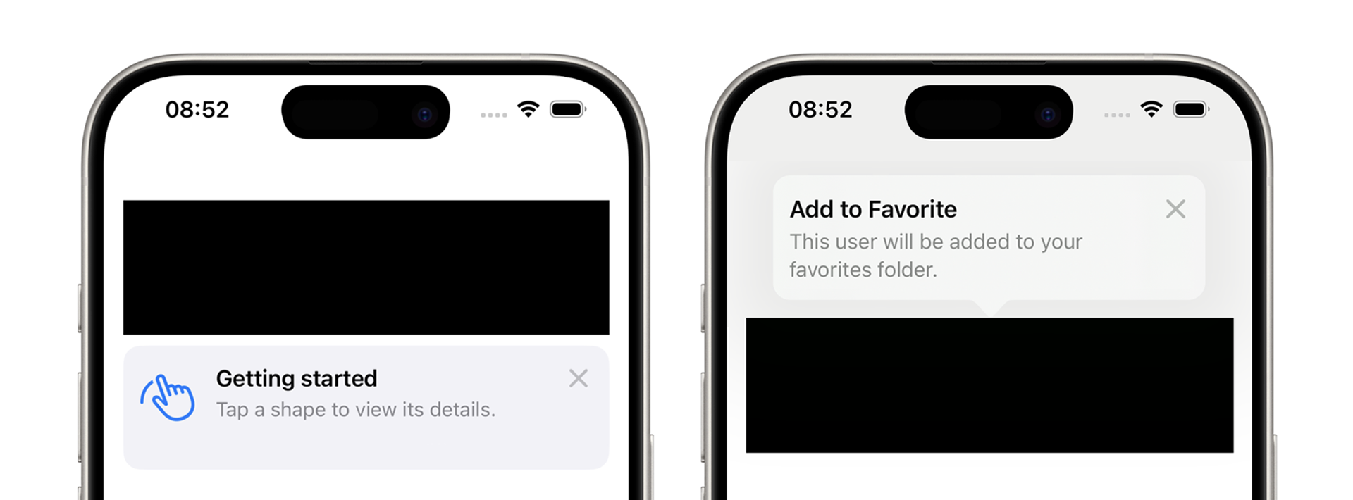
struct FavoritesTip: Tip {

   var title: Text {
      Text("Add to Favorite")
   }

   var message: Text? {
      Text("This user will be added to your favorites folder.")
   }

   var image: Image? {
      Image(systemName: "heart")
   }
}
There are two kinds of tips - Popover is shown on top of the interface, and Inline is embedded as a classical view.
Popover
For SwiftUI
Call the popoverTip modifier on the view to which to add a tip:
Image(systemName: "heart")
   .popoverTip(FavoritesTip(), arrowEdge: .bottom)
For UIKit
We listen for tips via asynchronous method. When shouldDisplay is in the true, add a popover controller. Pass it the tip and the view to which to bind the tip:
override func viewDidAppear(_ animated: Bool) {
   super.viewDidAppear(animated)

   Task { @MainActor in
      for await shouldDisplay in FavoritesTip().shouldDisplayUpdates {

         if shouldDisplay {
            let popoverController = TipUIPopoverViewController(FavoritesTip(), sourceItem: favoriteButton)
            present(popoverController, animated: true)
         }

         // The cross won't work now, that's fine.
         // Next, let's see how to fix it
      }
   }
The Popover prompts always have an arrow, but the direction of the arrow may be different from what you specify. In UIKit, the direction of the arrow cannot be selected.
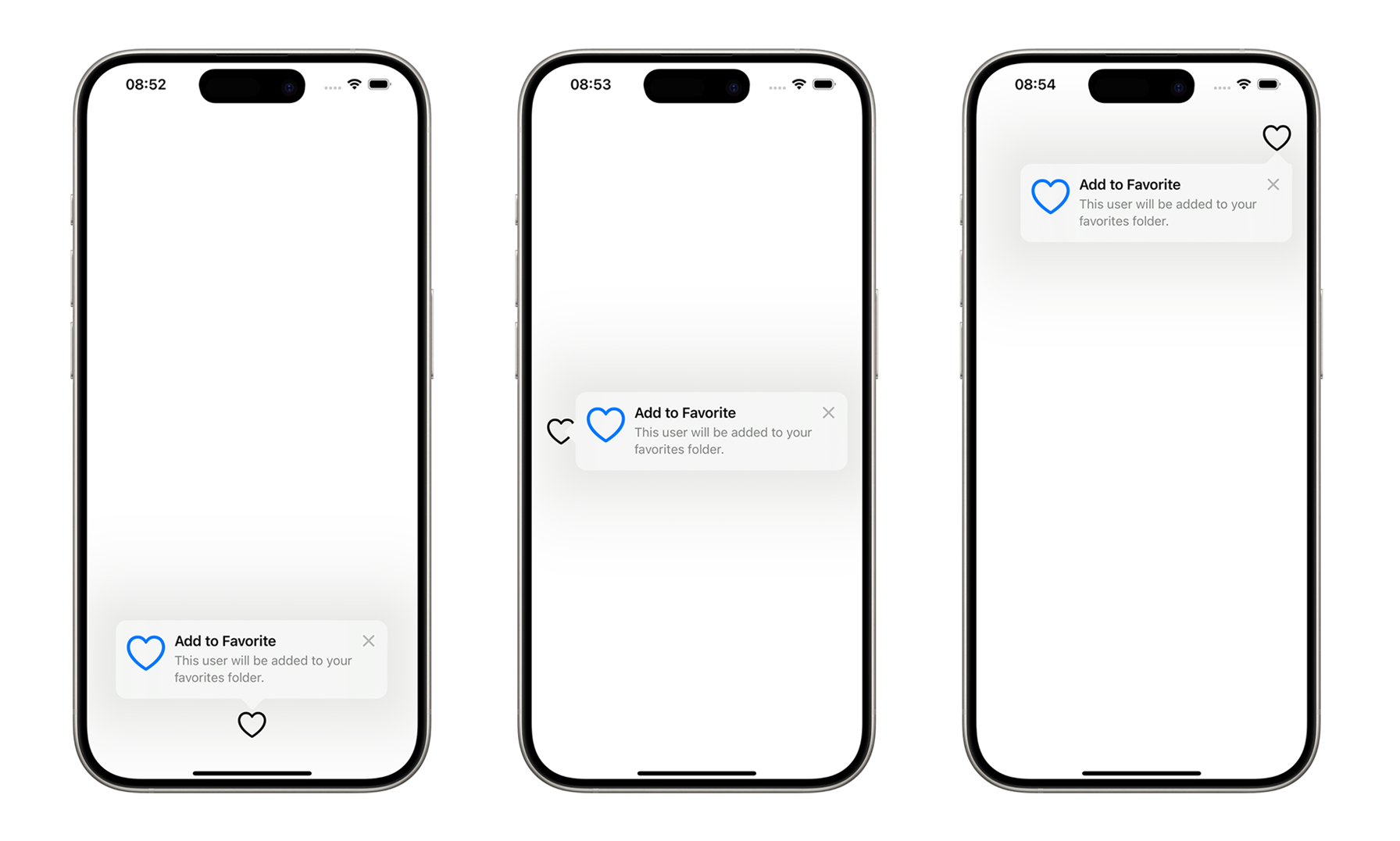
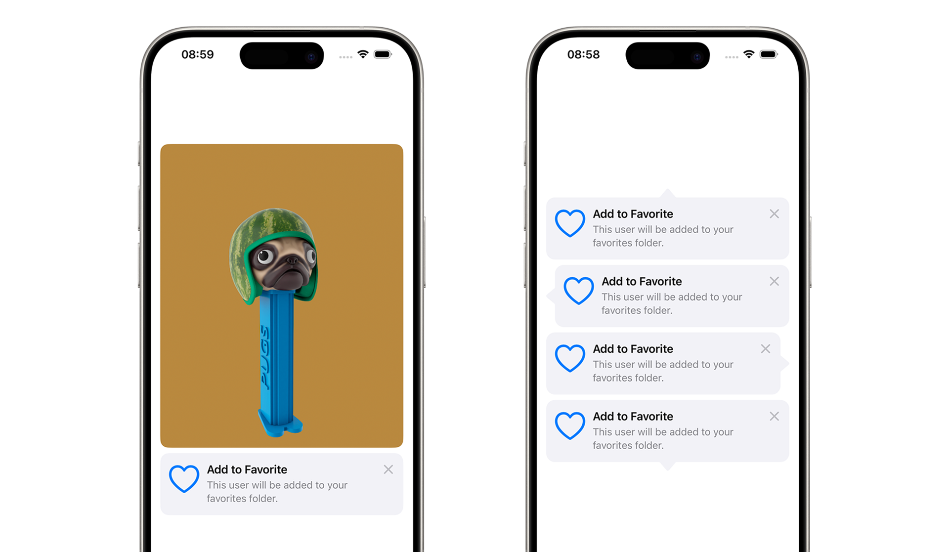
Inline
Inline tooltips are embedded between your views and change the layout. They do not override the app interface like Popover tips. Add them like ordinary views:
For SwiftUI
VStack {
   Image("pug")
      .resizable()
      .scaledToFit()
      .clipShape(RoundedRectangle(cornerRadius: 12))
   TipView(FavoritesTip())
}
For UIKit
Added the same way via asynchronous method, only when shouldDisplay in true:
Task { @MainActor in
   for await shouldDisplay in FavoritesTip().shouldDisplayUpdates {

      if shouldDisplay {
         let tipView = TipUIView(FavoritesTip())
         view.addSubview(tipView)
      }

      // The cross won't work now, that's fine.
      // Next, let's see how to fix it
   }
}
The Inline-tips have an optional arrow. The direction of the arrow will be exactly as you specify:
// SwiftUI
TipView(inlineTip, arrowEdge: .top)
TipView(inlineTip, arrowEdge: .leading)
TipView(inlineTip, arrowEdge: .trailing)
TipView(inlineTip, arrowEdge: .bottom)

// UIKit
TipUIView(FavoritesTip(), arrowEdge: .bottom)
Cell in UICollectionView
UIKit has a special cell class TipUICollectionViewCell for tips in a collection. It works like a classic cell, but for configuration you need to call .configureTip:
func collectionView(_ collectionView: UICollectionView, cellForItemAt indexPath: IndexPath) -> UICollectionViewCell {
   TipUICollectionViewCell
   cell.configureTip(NewFavoriteCollectionTip())
   return cell
}
Use .shouldDisplay to determine whether to show the tip or not:
NewFavoriteCollectionTip().shouldDisplay ? 1 : 0Manage as for a classic cell - via delegate methods for the collection.
A button can be added to the tip, and the button can be used to call your code. The button is needed to open a detailed tutorial or to direct to a specific screen.
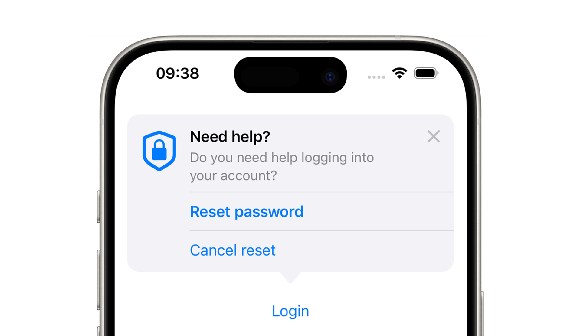
The buttons are set in the protocol in the actions field:
struct ActionsTip: Tip {

   var title: Text {...}
   var message: Text? {...}
   var image: Image? {...}

   var actions: [Action] {
      Action(id: "reset-password", title: "Reset Password")
      Action(id: "not-reset-password", title: "Cancel reset")
   }
}
The id is needed to catch which button was pressed:
For SwiftUI
TipView(tip) { action in

   if action.id == "reset-password" {
      // Do what you need to do by pressing
   }
}
For UIKit
Task { @MainActor in
   for await shouldDisplay in ActionsTip().shouldDisplayUpdates {

      if shouldDisplay {
         let tipView = TipUIView(ActionsTip()) { action in

            if action.id == "reset-password" {
               // Do what you need to do by pressing
            }

            let controller = TipKitViewController()
            self.present(controller, animated: true)
         }
         view.addSubview(tipView)
      }
   }
}
Close the tip
The user can close the tip by clicking on the cross. But you can also close it with code. The code is the same for SwiftUI and UIKit:
inlineTip.invalidate(reason: .actionPerformed)In the method, provide a reason why you closed the tip:
- .actionPerformed - the user performed the action in the tip
- .displayCountExceeded - the tip has been shown the maximum number of times
- .tipClosed - the user has clearly closed the tip
In UIKit, you need to add code for the cross. For popover-tip, close the controller:
if presentedViewController is TipUIPopoverViewController {
   dismiss(animated: true)
}
For the inline-tip, we remove the view:
if let tipView = view.subviews.first(where: { $0 is TipUIView }) {
   tipView.removeFromSuperview()
}
Rules for tip: when to show
When to show, the tip is configurable via parameters:
struct FavoriteRuleTip: Tip {

   var title: Text {...}
   var message: Text? {...}

   @Parameter
   static var hasViewedTip: Bool = false

   var rules: [Rule] {
      #Rule(Self.$hasViewedTip) { $0 == true }
   }
}
The Rule checks the value of the hasViewedTip variable, when the value is true, the tooltip will be displayed.
For SwiftUI
struct ParameterRule: View {

   var body: some View {
      VStack {
         Spacer()
         Button("Rule") {
            FavoriteRuleTip.hasViewedTip = true
         }
         .buttonStyle(.borderedProminent)
         .popoverTip(FavoriteRuleTip(), arrowEdge: .top)
      }
   }
}
For UIKit
Task { @MainActor in
   for await shouldDisplay in FavoriteRuleTip().shouldDisplayUpdates {

      if shouldDisplay {
         let rulesController = TipUIPopoverViewController(FavoriteRuleTip(), sourceItem: favoriteButton)
         present(rulesController , animated: true)
      } else if presentedViewController is TipUIPopoverViewController {
         dismiss(animated: true)
      }
   }
}

@objc func favoriteButtonPressed() {
   FavoriteRuleTip.hasViewedTip = true
}
When a tip depends on another tip
In this example, GettingStartedTip will appear first, followed by FavoriteRuleTip:
struct GettingStartedTip: Tip {...}

struct FavoriteRuleTip: Tip {

   var title: Text {
      Text("Add to Favorite")
   }
    var message: Text? {
      Text("This user will be added to your favorites folder.")
   }

   @Parameter
   static var hasViewedGetStartedTip: Bool = false

   var rules: [Rule] {
      #Rule(Self.$hasViewedGetStartedTip) { $0 == true }
   }
}
Now an example of how to change flags between tips:
VStack {
   Rectangle()
      .frame(height: 100)
      .popoverTip(FavoriteRuleTip(), arrowEdge: .top)
      .onTapGesture {
         // User has performed an action, disable the GettingStartedTip tooltip
         GettingStartedTip().invalidate(reason: .actionPerformed)

         // The value hasViewedGetStartedTip true, so show the FavoriteRuleTip.
         FavoriteRuleTip.hasViewedGetStartedTip = true
      }

   // Tip is immediately visible
   TipView(GettingStartedTip())
}
Several tips at the same time
Inline-there can be as many tips on the screen as you like. Popover-tip can be one, but they can be shown one by one via flags. I described how it works in the previous section.
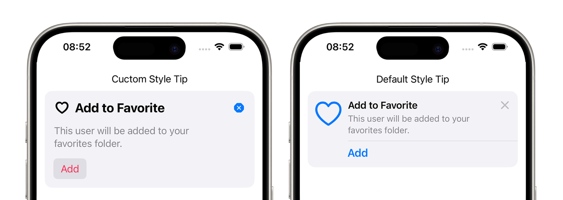
Tip Customization
The TipViewStyle protocol defines the style of the tip. The style can then be applied to any tip.
The configuration parameter in the makeBody method is access to texts, images and buttons that can be customized:
struct MyTipViewStyle: TipViewStyle {

   func makeBody(configuration: Configuration) -> some View {
      VStack(alignment: .leading, spacing: 16) {
         HStack {
            HStack {
               configuration.image
               configuration.title
            }
            .font(.title2)
            .fontWeight(.bold)

            Spacer()

            Button(action: {
               configuration.tip.invalidate(reason: .tipClosed)
            }, label: {
               Image(systemName: "xmark.octagon.fill")
            })
         }

         configuration.message?
            .font(.body)
            .fontWeight(.regular)
            .foregroundStyle(.secondary)

         Button(action: configuration.actions.first!.handler, label: {
            configuration.actions.first!.label()
         })
         .buttonStyle(.bordered)
         .foregroundColor(.pink)
      }
      .padding()
   }
}
Here you can create a button to close the tip. .tipClosed — explicitly close the tip by cross.
Button(action: {
   configuration.tip.invalidate(reason: .tipClosed)
}, label: {
   Image(systemName: "xmark.octagon.fill")
})
Add to SwiftUI:
TipView(MyFavoriteTip())
   .tipViewStyle(MyTipViewStyle())
Add to UIKit:
let tipView = TipUIView(MyFavoriteTip())
tipView.viewStyle = MyTipViewStyle()
TipKit in Preview
If you close a tip in Preview, it will not appear again — this is not convenient. To make the tips appear every time, you need to reset the data storage:
SwiftUI
#Preview {
   TipKitDemo()
      .task {

         // Reset data store
         try? Tips.resetDatastore()

         // Configuring
         try? Tips.configure([
            .displayFrequency(.immediate),
            .datastoreLocation(.applicationDefault)
         ])
      }
   }
UIKit
Add to AppDelegate:
try? Tips.resetDatastore()